

Packaging is made to be thrown away, and because of that, it’s tempting to think that bad packaging design is not a big deal. But disposable though it may be, packaging accomplishes a number of important tasks: it makes a product stand out, protects the product from damage, fosters an impression of quality and creates a tactile experience for the customer.
There’s a reason why unboxing videos continue to be popular—the feeling of joy and reward of opening a present (even a present to yourself) is contagious, counteracting the guilt of having spent money. While good packaging mostly works on the subconscious level, bad packaging is memorable for all the wrong reasons.
Every piece of packaging factors into the experience, from the shipping box to the interior stuffing to the wrapping and label design. As if that’s not complicated enough, there are also many different types of packaging, each tailored to a specific product style or shape. All of this is what makes bad packaging so common. The good news is bad packaging isn’t all bad—it can be a great learning opportunity. If you have an idea of what doesn’t work, then you can avoid making the same mistake for your brand. With that in mind, we’re going to look at some of the most heinous examples of bad packaging design and discuss how they could have been improved.
Bad outer packaging
—
The outermost layer of packaging can be used to protect a product and to group a variety of products into a single container. Both of these goals mandate a size and shape that match the product contents.
Oversized shipping boxes
A shipping box has the most practical task out of any packaging: it facilitates transit and keeps the product from getting damaged. Because these are often generic cardboard boxes with no design attached to them, some businesses think any old box will get the job done, which as the images below suggest is flawed logic.
Tips for better packaging
While mega-conglomerates like Amazon can afford the shipping costs of using oversized boxes, financial waste isn’t the only issue here. Not only does this annoy the recipient by giving them more trash to deal with, but excess cardboard is not as environmentally friendly as it is often assumed to be. It takes a lot of trees to generate the wood pulp needed for it, and cardboard creates methane when broken down.
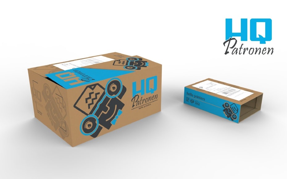
The solution here is an obvious one: plan ahead for shipping boxes with the appropriate dimensions for every shipping scenario. And while a generic box is perfectly acceptable, companies who regularly ship products can consider investing in custom shipping boxes. Why miss out on another opportunity to enhance the unboxing experience?
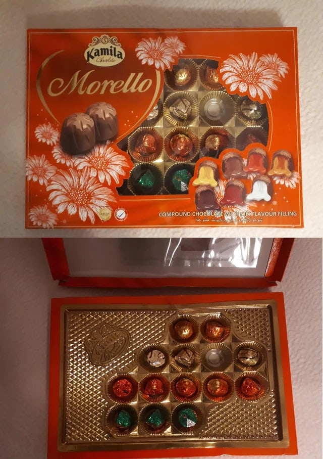
Misleading product packaging boxes
A product packaging box is usually the container you would see on shelves in a physical store. Similar to shipping packages, this is usually meant to be thrown away after purchase, and brands have to be conscious of the waste they are creating for the customer.
For some brands, the excess packaging here is intentional: a larger box creates the assumption that the product it houses is equally large.
Tips for better packaging
Tricking the customer is, at best, a quick win. The product may sell at the moment, but the feeling of betrayal will stick around long after purchase. A misleading oversized box is not only dishonest (and arguably a form of false advertising), it is entirely unnecessary. The following design shows that big doesn’t necessarily mean better. In the hands of a talented designer, small designs can be just as inviting and make more sense for the product you’re selling.

Bad interior packing material
—
The interior of a package is meant to secure the product during travel, and when implemented creatively, it can bury and conceal the product, contributing to the unboxing experience.
Excess and unnecessary stuffing
Because stuffing is meant to safeguard products in transit, it is most critical for fragile items. More durable items may still require stuffing to secure the product and keep it from rattling around inside the box. That said, the common materials often used for stuffing like cardboard, styrofoam, tissue paper and bubble wrap aren’t the most environmentally friendly, so it’s important not to go overboard if it can be helped.
Tips for better packaging
As with any part of the packaging, the interior should be taken seriously and treated as part of the design.
When packing material is not necessary to prevent damage, you can opt for an interior tray to hold the product in place while also creating an inviting visual display for the customer.
And when stuffing is necessary for fragile items, consider sustainable alternatives like glassine (instead of tissue paper), mushroom and green cell foam (instead of styrofoam).
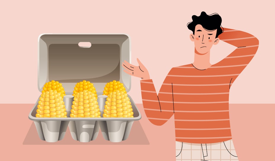
Sneaky stuffing
Like a lot of excess packaging, stuffing is sometimes used to fool the customer into believing the quantity of the product is greater than it is. While this can be a harmless mistake, resulting from an overzealous packager, it’s hard to believe the following examples are not intentionally misleading.
Tips for better packaging
If a product box or container needs additional stuffing, it is probably too large. A container that matches the product dimensions will keep the contents secure. If additional stuffing is necessary, keep it outside and around the product container.
Bad packaging containers
—
The container is used to directly house a product (especially when it is a liquid, paste or consists of several small pieces), and it is designed for reuse throughout the product’s lifecycle. Some examples include bottles, cans, pouches, bags, tubes and more. In addition to housing the product, the container should convey expectations, such as what the product is and how much of it the buyer can expect. Its form can also be used to sell the product, and some brands choose to focus solely on that.
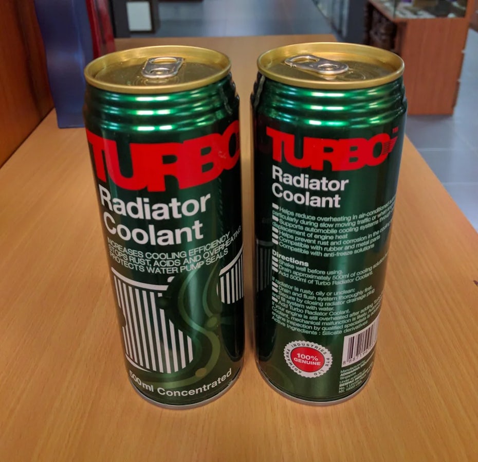
Misuse of traditional containers
A number of products come with traditional containers. For example, we intuitively understand that a can with a pop lid is meant to be drunk. That’s why you probably don’t want to use this type of container for radiator coolant.
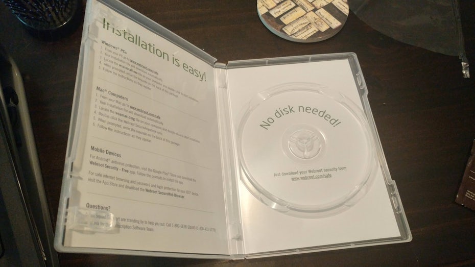
Similarly, if your software product doesn’t require a disc, packaging an access code in an empty disc case is both a waste of money and plastic.
Tips for better packaging
The container is one area of packaging design where it’s best not to get too creative. As with user experience design, your number one priority is to use visual cues to match the buyer’s intuitive understanding of how a product should work.
Mismatched containers and odd shapes
Some brands forego traditional containers altogether with unique container shapes. The result is often excessive packaging and a misrepresentation of the product.
Tips for better packaging
Even the most creative shapes should make their practical function the ultimate goal. They also need to effectively convey the nature of the product. One way to accomplish these goals with a creative shape is through visual metaphor.
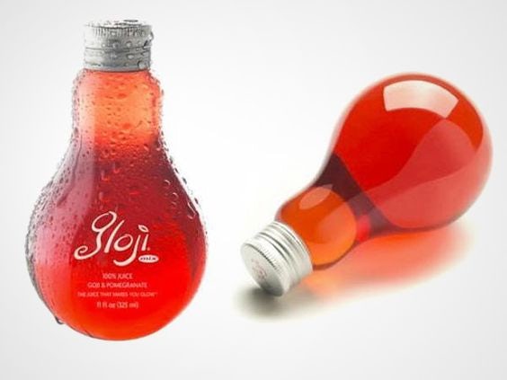
For example, the container pictured is clearly a bottle of liquid, but it is also in the shape of a lightbulb—a metaphor for the fact that this is an energy drink. Despite its odd shape, it maintains functionality as a bottle first and foremost: it includes a reusable twist-off cap, transparent material that shows the remaining quantity of liquid, and a bulbous base that naturally fits in your hand.
Bad product wrapping
—
Products are sometimes wrapped to seal in freshness, keep germs away and signal to the customer that the product has not yet been opened. While this is an important job, it is not necessary or relevant to all products. And because most wrapping is plastic, you should reserve wrapping for products that absolutely need it.
Individual wrapping
Some products that are consumed individually, such as a deli sandwich, do deserve to be individually wrapped. When products are meant to be bought in bulk, individual wrapping becomes a comical nuisance at best and a complete environmental waste at worst.
Tips for better packaging
Individual wrapping should be restricted to larger, single-use items that are meant to be purchased individually. Very rarely is anyone purchasing one piece of candy or one slice of bread. These are better contained in a bag or pouch.
When it comes to production, consider that plastic wrapping is not only wasteful, it can interfere with the regulation of moisture and oxygen, advancing rot. For loose produce (such as herbs) that does need a container, consider natural alternatives to plastic, like cellulose.
Excess wrapping
While some products do require wrapping, that doesn’t mean the entire object needs to be covered. But some brands find it necessary to seal the product as though it is heading to outer space.
Similarly, one form of wrapping should be more than enough. If your product is already contained in bottles that are in turn held together by cardboard, what is an extra layer of wrapping even accomplishing?
Tips for better packaging
Wrapping should only be used when it is serving a relevant purpose. For keeping it fresh, the only part of the product that needs to be sealed is the lid. For keeping a product secure and easy to handle, there are better packaging alternatives like cardboard that accomplish this goal.
Impregnable plastic shells
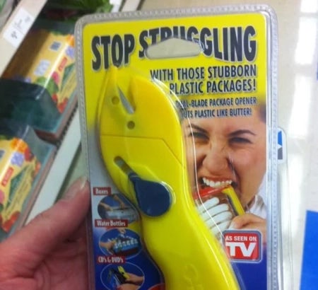
Wrapping is sometimes used to discourage theft, and some packages take this job a little too seriously, constructing impregnable fortresses of plastic. The common result is “wrap rage”, where customers are driven to near madness over the struggle to open a package.
Tips for better packaging
Theft is ultimately a concern for the store. A packaging design should be concerned with displaying the product and providing a friendly opening experience for the purchaser. Consider securing the product with ties against a back of the cardboard that can be easily torn open. At the end of the day, the packaging has to be designed for the buyers, not for the thieves.
Bad packaging label designs
—
The graphic design of a package does more than make a product look pretty. The box cover and label designs make important information, such as the product name, type/flavor, quantity, requirements, and safety, clear and easy to parse. Design can also act as an indicator of quality—consider what assumptions you might make about a drink sold in an unmarked can.
A professional designer can make packaging you’d hesitate to throw away. On the other hand, an inexperienced designer can make packaging that you’d give no thought to tossing away. To stay on theme, let’s take a look at how packaging label design can go wrong—and therefore what to avoid.
Bad packaging typography
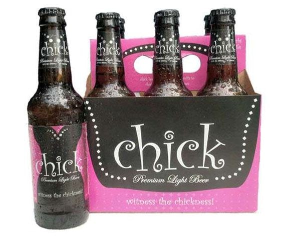
Typography is the style of letters used (a “font” when implemented into the software). As with all things style, there are certain font trends that have gone out of fashion. Either they are overused or they are overly decorative, resulting in gaudy try-hard typefaces. One of these is Curlz, a font whose many loops create an incessant childish effect. It is doubly insulting on this beer brand “for chicks,” which stereotypes feminine handwriting. Similarly, the tagline beneath the brand name uses such a small, overly cursive font that it is difficult to read.
Typography is also used to differentiate between lines of text, communicating degrees of importance through visual hierarchy. But the label for this black raspberry jam product has fonts that are mostly alike in color, size and style—in addition to some truly questionable word choices.

Tips for better packaging
Different font styles come with different built-in associations, and some are more appropriate for certain brands than others. Before designing, you should familiarize yourself with the different types of fonts and know which fonts are commonly considered bad. Custom lettering from a talented designer is a surefire way to avoid font mishaps, and your design will be all the more original.
Good typography also uses contrast (such as varying size, color and weight) to communicate hierarchy. This makes it easy for a customer to distinguish the information at a glance.

Bad packaging colors
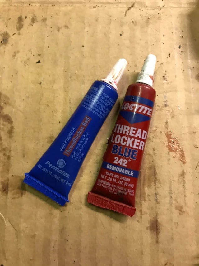
Color can make a packaging design overall pop, but when used naturalistically, it can clarify what a product contains. That’s why you probably want to avoid storing red paint in a blue package and blue paint in a red package, like this hapless manufacturer.
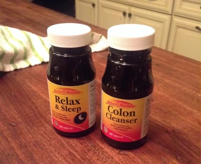
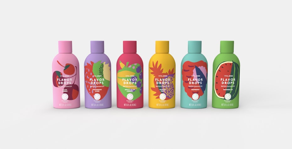
For different flavors or product varieties that belong to the same product line, color can be a way to differentiate each variation while keeping the rest of the branding consistent. Consider, for example, the disaster that might strike if a customer were to confuse these two products.
Tips for better packaging
Color has inherent associations that are key for communicating the nature of a product. For food and beverage products, color should be used naturalistically—like red for strawberries—to match the customer’s expectations. For other products, the color choice can be linked to the feeling that is most closely associated with the product, such as tranquility or excitement. Either way, bold use of color is one of the best tools for illustrating the difference between product varieties.
Bad use of imagery
Packaging uses imagery to convey the experience of a product before it has been purchased. Of course, it’s helpful when that experience is within the realm of possibility, unlike this unclimbable rope whose label features the image of a mountain climber.

Similarly, a product photo will often be used to show the ideal version of a product. But some brands go a little too far in their wishful thinking.
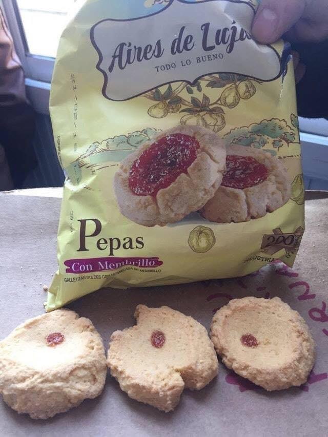
Tips for better packaging
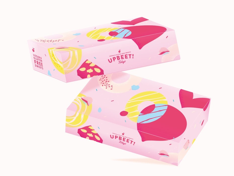
If an image is meant to be an idealized form of the product, consider using an illustration rather than a photo. This signals to the customer that what they are seeing is not an exact representation, especially when the imagery is abstract, as in the “Upbeet” box design for vegan sweets.
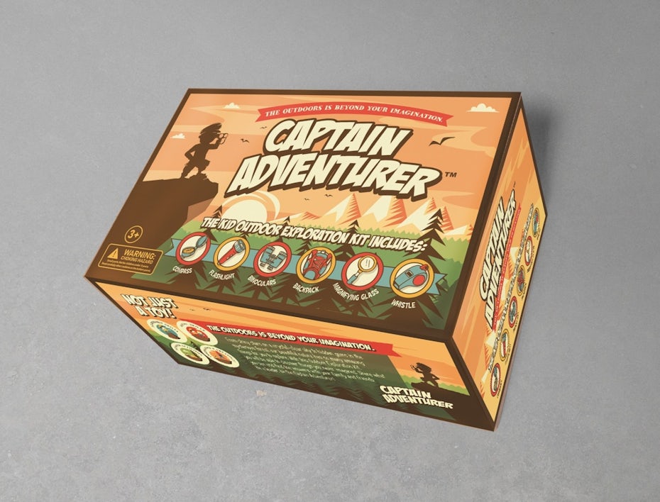
If a product is meant to convey an experience, aspirational imagery can be used, as in the “Camp Adventurer” box design. Unlike the rope label pictured earlier, this aspirational image is actually achievable.
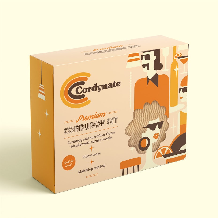
Packaging imagery can also serve to set a mood, as in the vintage 70s vibe depicted in the “Cordynate” box design.
Bad packaging design is only good for one thing
—
Bad packaging design can make a brand the subject of ridicule, but that is the least of its sins. It can be frustrating for customers, creating unnecessary barriers to accessing a product or the burden of extraneous disposable material. Even worse, bad packaging can produce non-biodegradable waste and harm the environment.
Good packaging should not be treated as an afterthought—the brand will research sustainable materials and casings that fit the dimensions of the product. But this is easier said than done. Between the outer box, the stuffing, the wrapping and the label design, there can be a lot of moving parts involved in achieving good packaging. That’s why the most essential asset of good packaging design is a great designer, one who knows how to make these elements work together in harmony and how to craft an unforgettable unboxing for the customer.
Need reliable packaging designs for your product?
Our designers can help you create just about anything.


Leave a Reply